We understand this:
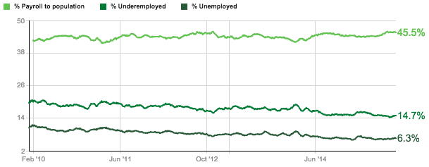
Credit: Gallup
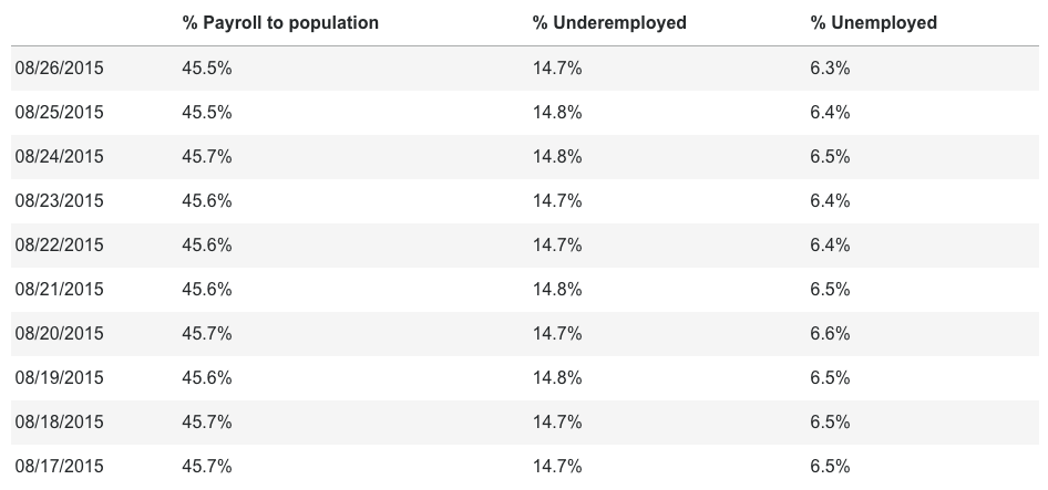
Credit: Gallup
Credit: Gallup

Credit: Gallup
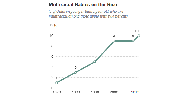
Credit: Pew Research Center
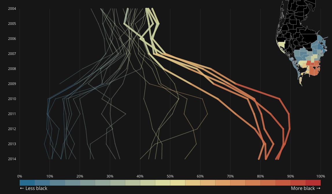
Credit: Tampa Bay Times

Credit: Washington Post

Credit: Tampa Bay Times
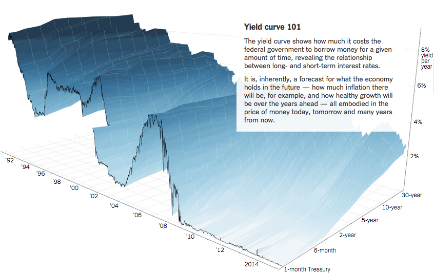
Credit: New York Times

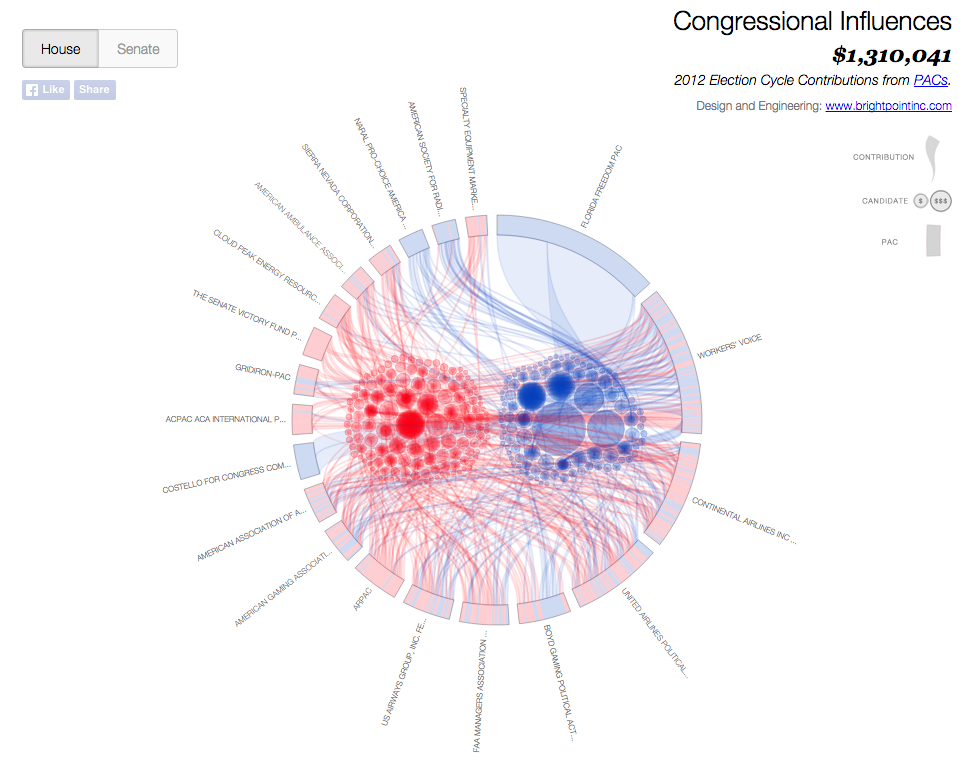
Credit: Jim Vallandingham

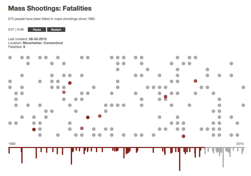
Credit: ProPublica

Credit: Polygraph